
Board elements
Beyond groups, your board can hold standalone elements placed directly on the grid. Open the add-elements drawer and pick an Element type to drop one onto the board, then drag and resize it like any other widget.
Two zones
The board has a top action bar and the main board below it. Shortcuts can live in either zone — drag one up into the action bar for quick access, or down onto the board. Both zones allow free placement - widgets stay exactly where you drop them, and their position is remembered across reloads.
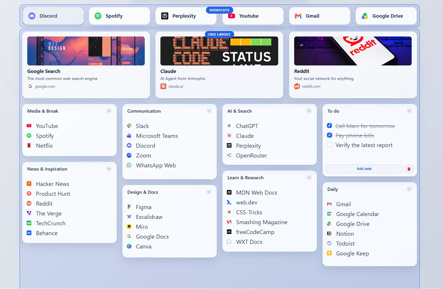
The two board zones — the top action bar and the main board.
Shortcuts
Standalone action buttons that don't need to live inside a group.
Shortcut
A link button — a clickable shortcut to a website, placed directly on the board.
- Name and URL
- Icon picker, icon color, and size
- Optional open-target override
- Display style: Standard button, Tile, or Large tile - the tile styles are square icon cards with an optional label, so a row of tiles can double as a clean icon dock
A Shortcut button on the board.
Clipboard button
Copies stored text to your clipboard when clicked.
A Clipboard button on the board.
Launcher button
Opens an app, folder, file, or command straight from the board.
A Launcher button configured to open a folder.
Companion requirement
Folder, File, and command launchers require the companion app. App URI and protocol launchers do not.
Routine button
Runs a saved routine — an ordered list of steps — with one click. A routine can open URLs, launch apps, copy text to the clipboard, switch workspaces, open files or folders, and pause between steps. See Routines for the full list of step types and the steps editor.
The button shows a play icon and a badge with the number of steps.
Sections and content blocks
Layout and content elements for building a richer, document-style board.
| Element | What it is |
|---|---|
| Heading | A section title (H1 / H2 / H3) |
| Step heading | A numbered heading for ordered, walkthrough-style boards |
| Text | A block of text (supports inline markdown) |
| Callout | A highlighted note with an info / tip / warning / success / error variant |
| Code block | Monospaced, preformatted code |
| Steps | A numbered list of steps |
| Image | An image embedded by URL (no hosting required) |
| Profile | A profile card with a preset avatar |
| Link card | A rich link card with thumbnail, title, and description |
| File | A file card that opens a download/file URL (auto-detects PDF, doc, sheet, image, etc.) |
| Divider | A horizontal rule with adjustable thickness |
Editing content blocks
Text-bearing blocks (text, callout, code, steps, profile, link card) use an edit toggle: type your content, then click away to render it. Markdown is supported in the text-style blocks.
Images stay private
Images and profile avatars are referenced by URL — ReadyTab never uploads or hosts your files.