
Groups and items
Groups are the main containers in the grid. Each group holds a list of items. Groups can be styled, renamed, duplicated, collapsed, and deleted. There is also undo support for delete actions.
Group actions
- Rename a group
- Duplicate a group
- Collapse or expand a group
- Delete a group
- Undo a recent delete
- Set or clear accent colors
- Open the group style editor
Group style editing
- Card styling
- Header styling
- Link styling
- Copy style
- Paste style
Empty group quick-fill
A brand-new or newly emptied group shows inline shortcuts in its body so you can fill it fast: Import from bookmarks (pick a bookmark folder to pull its links straight into the group), plus Add link, Add clipboard, and Add launcher. The buttons disappear automatically once the group has at least one item.
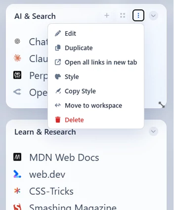
The group options popover — open it from the ⋯ menu on a group's header.
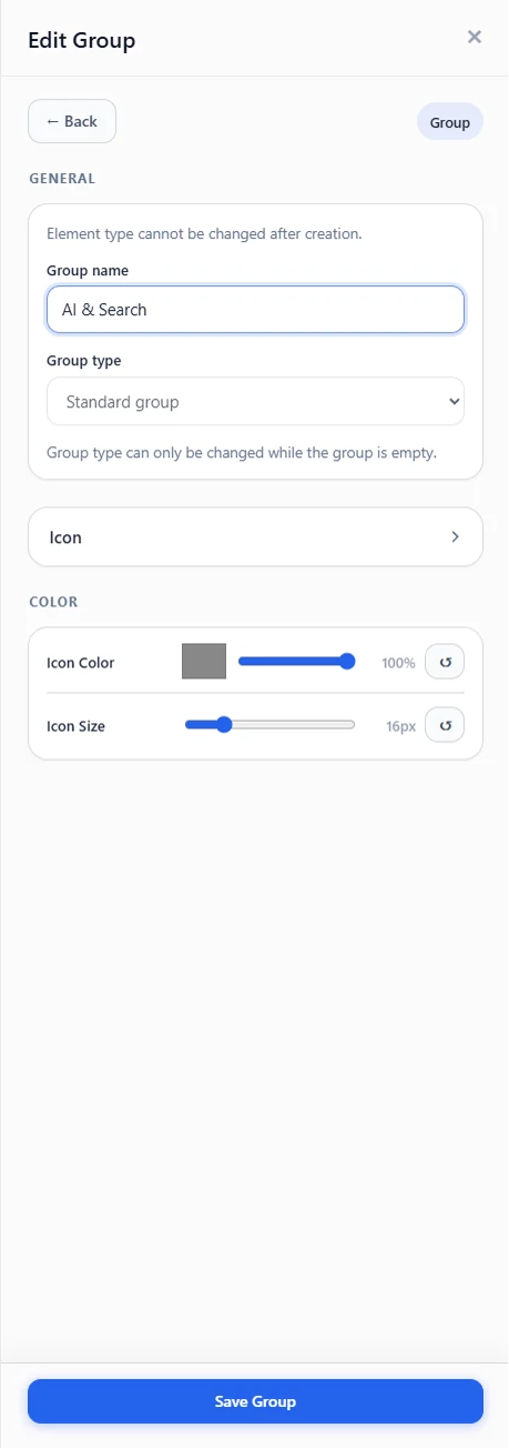
The edit-group drawer, where you rename and style a group.
Item types
Implemented item types
Link, Header, Divider, Text, Todo, Clipboard, Launcher, and Routine.
Link
A clickable shortcut to a website.
- Name and URL
- Optional description
- Optional open-target override
- Icon picker and icon search
- Icon color and text color styling
- Duplicate, copy title, copy URL, and delete actions
- Convert to a top-level element from the ⋯ menu - as a standard Shortcut, a Tile, or a Large tile (also available for clipboard, launcher, and routine items)
Header
A title row to label a section inside a group.
- Left, center, or right alignment
- Optional separator line
Divider
A horizontal line to visually separate items within a group.
Text
A block of plain text for notes or labels.
- Normal, bold, or italic styling
Todo list
A task-focused list. Add it as its own element — pick To-do list in the add-elements picker (alongside Group), no group-type toggle needed.
- Quick Add task action at the bottom of the group
- Compact clear-all-tasks button with confirmation
Supported items
A to-do list accepts only Todo, Header, Divider, and Text items. Link, clipboard, launcher, and routine items live in standard groups instead.
Todo
A single task you can check off.
- Click the task row to mark it complete or incomplete
- Completed toggle also available in the editor
- Completed tasks stay in place and keep their saved state
Clipboard
An item that copies stored text to your clipboard when clicked.
Launcher
Opens apps, folders, files, or commands straight from your dashboard.
- App URI or protocol launchers
- Folder launchers
- File launchers
- Command / script launchers
- Optional terminal visibility for command launchers
Companion requirement
Folder, File, and command launchers require the companion app (Windows, macOS, and Linux). App URI and protocol launchers do not.
Routine
Runs a saved sequence of steps with one click — open URLs, launch apps, copy text, switch workspaces, open files/folders, or pause between steps. A routine item shows a play icon and a step-count badge. You can also convert it to a top-level Routine button from its overflow menu (and back). See Routines for details.
Adding items
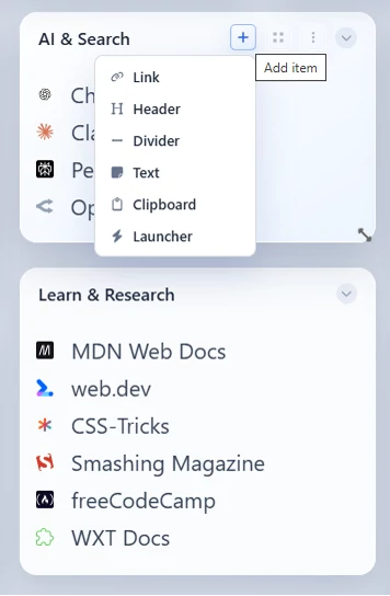
Adding an item to a group — pick from the available item types.
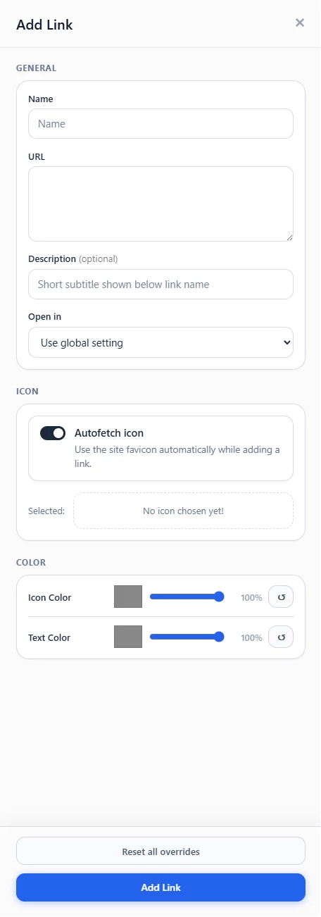
The Add Link drawer with link fields, icon picker, and color controls.