
Overview
ReadyTab replaces the browser new tab page with a dashboard organized into spaces, groups, and items. The main screen includes workspace tabs, an optional logo area, an optional web search bar, an optional clock, a floating Add Group button, a Spotlight search trigger, and settings.
Main interface elements
How ReadyTab is organized
The dashboard is made up of a few regions:
- Spaces — switch between separate dashboards from the tabs at the top.
- Shortcuts — quick-launch buttons pinned in the top action zone.
- Main grid — your groups of links and other items, laid out on the board below.
- Settings + New — the buttons in the top-right corner open Settings and add new elements to the board.
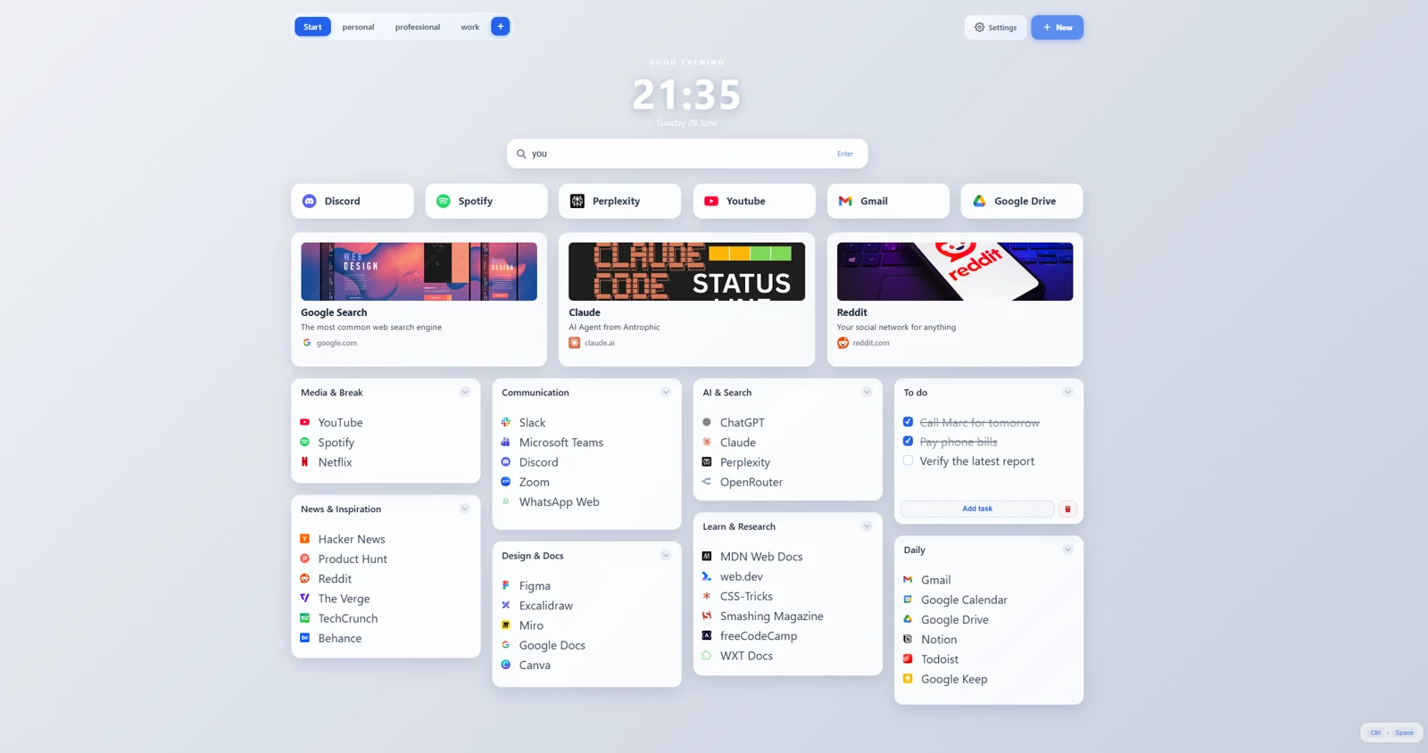
Annotated view of the dashboard regions: spaces, shortcuts, the main grid, and the settings and new buttons.
Empty state behavior
An empty first board offers Import bookmarks → Choose folders, Popular sites → Browse sites, and Start blank → Add group. Bookmark import lets you select folders and links, preview their groups and assign destination spaces. Popular sites can become large shortcuts or named groups. Both flows fit group heights and compact the layout; Undo is available after adding content.
The Set up the essentials panel changes link targets, clock, search, Spotlight, favicons, theme and logo without opening Settings. Later empty spaces show a smaller setup panel. See Quick start.
Changes made in the side panel apply immediately and stay in sync with the main Settings modal. Session recovery is kept separate and does not appear in the empty state.
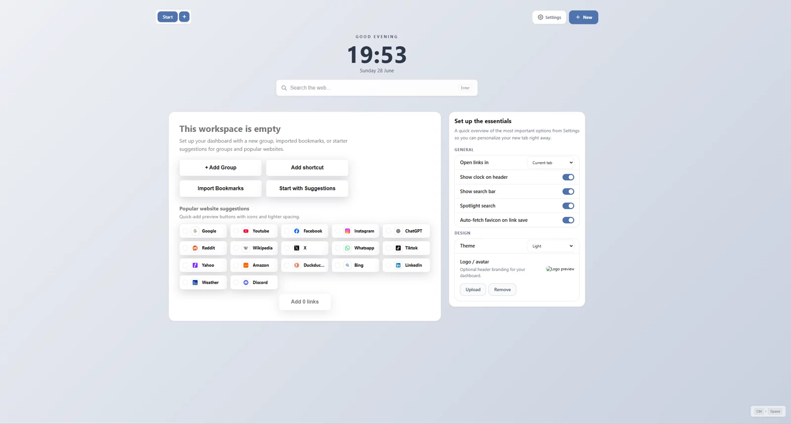
ReadyTab empty state dashboard.
Sync and Full
Free includes unlimited local spaces. Sync and Full add personal cloud workflows:
- encrypted cloud dashboard snapshots
- automatic delayed cloud sync
- optional safe auto-pull when local state is clean
- conflict review instead of silent overwrite when local and cloud both changed
Full also adds share-code creation, public publishing and team-board hosting. Team editors can use the owner’s shared edit key for free. See Plans and licenses.